The idea of above-the-fold content came into the picture back in 1440. The visible fold of the newspaper was referred to as above the fold and contained the most catchy headlines convincing a reader to buy the newspaper
With digitalization, the concept of above-the-fold content changed slightly but still had the same importance. Now, Above the fold is a very important part of web designing. Above-the-fold content is the first impression of your website on a visitor.
Page Contents:
What Is Above The Fold?
The visible part of a web page before scrolling down is above the fold. It is the first section of your website that a visitor sees. Since it’s the top section of your website, it grabs the most attention. Above-the-fold contents convey what an organization does and its advantages.
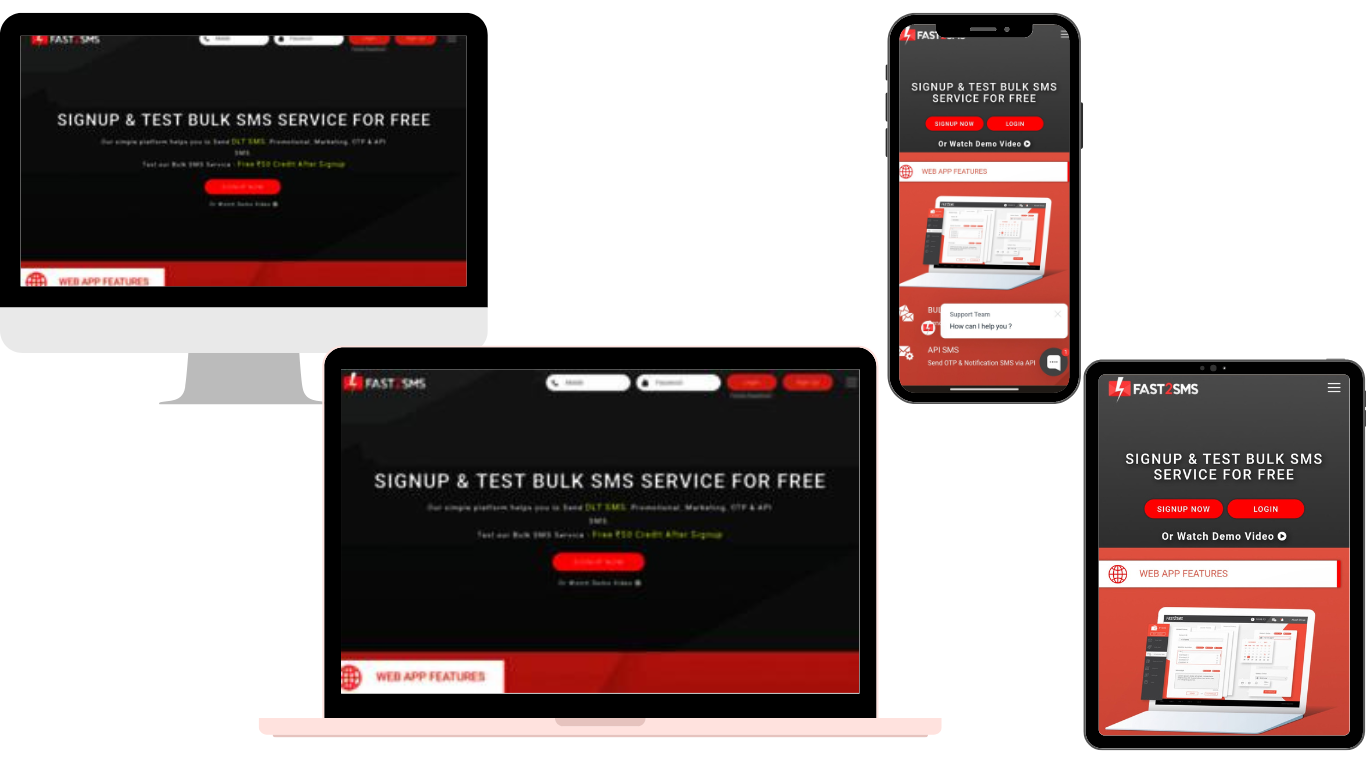
Most screens show the top 600 pixels of a page in the above-the-fold content. According to many developers, the general above-the-fold content is 1000 pixels wide and 600 pixels tall. The best traditional dimension for the above page content is 1024×786, but the dimension has now changed to 320×568 and 340×640 pixels.
The section presents the most engaging headlines, content and images. According to many researchers, it has been concluded that keywords and headings near the top of the pages are very crucial.
Above The Fold For SEO
Above the fold, content doesn’t directly affect the SEO, but indirectly, it is one of the major factors. According to Google, the space above the fold has a high value; therefore, it should be helpful.
According to studies by Nielsen Norman Group, in 2010, about 80% of the viewing time was spent on above-the-fold content, whereas only 20% was spent on below-the-fold content.
These stats showed a big difference in 2018, stating that 57% of the viewing time was spent on above-the-fold content and 43% on below-the-fold content. Out of the time spent on a website, about 75% is spent on the first two folds of the content.
These stats prove how important above-the-fold content is for a website. All the search engines mainly focus on the user’s experience. Above the fold section is the key to occupying the audience’s attention. This impacts the branding of your website.
If your first impression is optimized enough, you will gain trust, increase your SERP ranking, and enhance your SEO.
Mistakes Of The Above-The-Fold Content
- Using image background incorrectly: developers often overlay text on a busy background which fades the idea of the page. There is no contrast between the content and the text. Use the negative space of the images for your context.
- Not using hierarchy: the main title should be above the fold and have an overview of the page.
- Web designs sometimes have too many buttons with inconsistent style. The buttons should be minimum with consistent style and uniformity.
- Too big logo: using a logo is a must for the website, but having a too-big logo is, however, not preferred. Using a big logo pushes the information down, and you will only see a logo above the fold.
- Having a lost bottom above the fold: some websites have a banner design covering the above-the-fold section. This misleads the visitors to believe that that is only the end of the website. The background should occupy 80% -90% of the space above the fold.
- Above the fold, content should not have any broken links. You will not like your visitors to have a bad experience landing on an expired page.
Best Practices For Above The Fold Optimization
We now know what is above the fold concept. The next question is what above-the-fold content should be like. Well, I have some tips that would help you optimize the content.
1. Orientation
Above-the-fold content is the deciding factor for users to stay or leave the web page. Therefore it becomes all the more important that it should be very attractive and interactive at the same time.
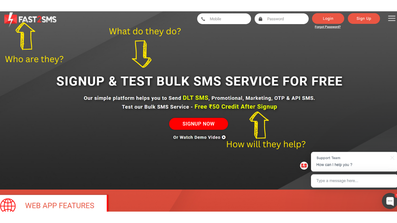
Suppose, While searching for something, you land on a page where the above-the-fold section has a beautiful picture but no information. Like this one below, you will not get any idea of the business and will bounce back. Above-the-fold content must answer these three questions:
- Who are you?
- What does the business do?
- How can the business help a visitor?
2. Optimize your website’s header
Headers for all the pages of the website should be the same. These bring uniformity to your website and build your brand name. Having a big attractive headline is the most eye-catching element for above-the-fold content. The following checklist will help you create an attractive headline.
- Headlines should be informative.
- Headers should have a customized banner representing the brand.
- They may also include sign-in/ sign-up links.
- Should have the brand logo and taglines
- You can also include links to social media profiles.
- May have a search bar to explore your website
- You can also have a language choice option for a customized user experience.
- Headers must have contact details so that users don’t have to find ways to contact them.
3. Design your content for usability
All elements of the above-the-fold content should function properly. All the links and navigations should have a result page. You should not have broken links on above-the-fold content.
For instance, your product above the folded page has a video or an animatic background. Ensure it plays properly, loads smoothly, and has good picture quality. Another important aspect is to design your content in an easy-to-interact manner.
4. Navigation
Navigation should be easy and clear to understand and use. Always link your website logo with the homepage of your website; all the pages should have a back option. Optimizing navigation will enhance user experience and promote your pages and sub-websites.
Labelling of all the buttons, navigation and links should be concise. It should be the terms your users may use. Name every directing link button and navigation for better user understanding.
5. Visual Information
Pictures and videos attract more than text. You should first determine what you want to focus on and then add visual elements.
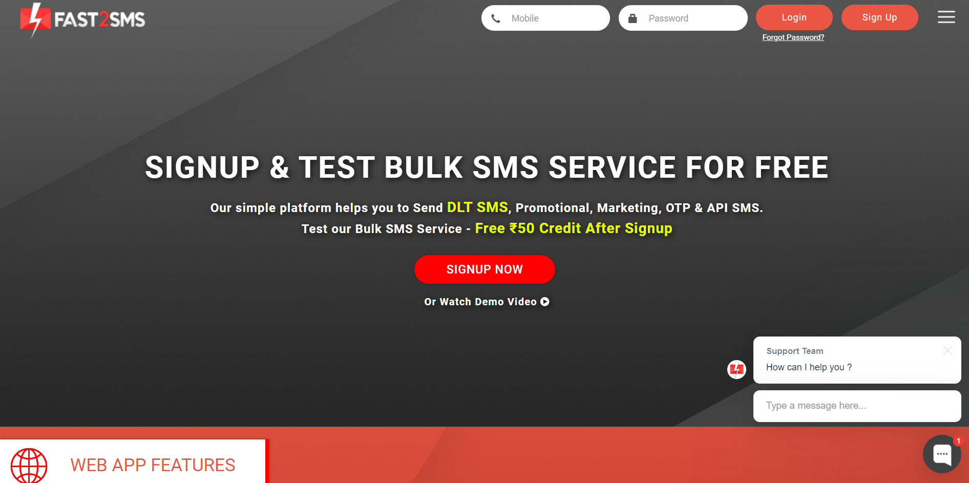
For example, if you want to emphasize the text, like the topic of the page, main heading, etc., you should go for a solid background like this.
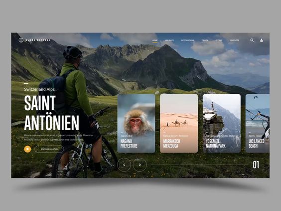
You may use images as background if you want an emotional impact on an audience. Many websites now use an image as the background for better branding like this.
If you want to be extraordinary and very creative, there is an option for using video or animation GIFs as a background. These are also very attractive to the audience.
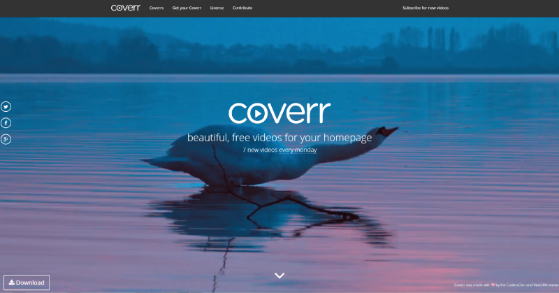
Choosing a background for your website is also a crucial task. You should keep in mind that the background should not overpower your main heading and elements. Your main focus should be on the niche of your websites. Keep your above-the-fold attractive but precise.