Have you ever wondered why blogs and websites have a particular layout? Having a good blog design helps in branding. A high-quality blog design contributes to the success of the blog. Let’s get, a bit deeper and understand How to Design a Blog, its Best Practices, and Examples.
Page Contents:
What Is Blog Design?
The process of blog design is the practice of optimizing the layout of a blog to enhance its branding and readability. The content is the most important part of a website or a blog. Visual blog designs also play a crucial role. If the designs are poor this may impact your blog negatively.
Using different visuals like themes, images, videos, and fonts. these visual elements help to attract audiences and improve the first experience of the new visitors.
Why Is Blog Design Important?
73.1 % of web developers believe that poor web designs are the reason why visitors leave a site. 94% of first impressions are based on the blog’s design. These statistics prove how vital is blog designing.
A blog with a good layout design tends to have better user engagement and keeps the reader on the page for a long time. It improves the user experience and builds on better brand perception. Hence, a good blog design increases traffic, share, and conversion rates.
How To Design A Blog?
As you now know the importance of blog designing let us move to the next step which is the designing of a blog. There are no steps as such but there are some essential pointers that you should consider. Let’s begin:
1. The first step is to choose a blogging platform that is easy to use. It should have multiple designs and theme options. It should be able to work simultaneously with multiple users.
2. Next comes designing an eye-catching homepage. Your home page should attract the audience and convince them to stay on your site for a longer time.
3. Create a rich blog with content full of reliable information. There is no replacement for high-quality content. The content should be engaging to make people read further and further. There should be a short description of the pages at the header.
4. The font size of the text should be legible. People leave the pages when the font size is too small. Keep the font size between 15px to 18px. It was observed that pages with big font sizes are comfortable to read.
5. Use a consistent design for all the blogs on your website. Use the same design and theme for all your blog articles. These make readers remember your articles and improve branding.
6. Use appealing visuals that have enough white space. Nobody is interested in reading big walls of text. White spaces help you break such walls and make it pleasant to see and read.
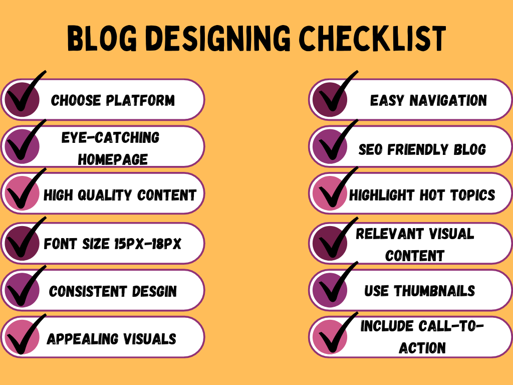
7. Add proper navigation elements. Make them creative yet easy to use. Complex navigation gives the wrong impression to the users.
8. The visuals should be relevant to the text and the niche. They should convey the message of your blog visually. Include header images with your brand’s logo.
9. Add meta tags, keywords, titles, and other SEO best practices to your blog design.
10. In the blog list page highlight the recent and relevant articles according to their search intent. Categories the pieces so that readers can easily find the relevant topics.
11. Use thumbnails for your articles. Thumbnails are images that give a preview of the images and help to attract the audience. Use colorful images for the thumbnails
12. Including call-to-actions. Tell your audience what to do next. Punching in the CTAs at least once or twice in your articles helps to convert leads.
Examples Of Blog Design
Are you still struggling to create a blog design? Here are some examples to show what a perfect blog design looks like. These examples are for different types of blog articles like news, an e-commerce platform, etc.
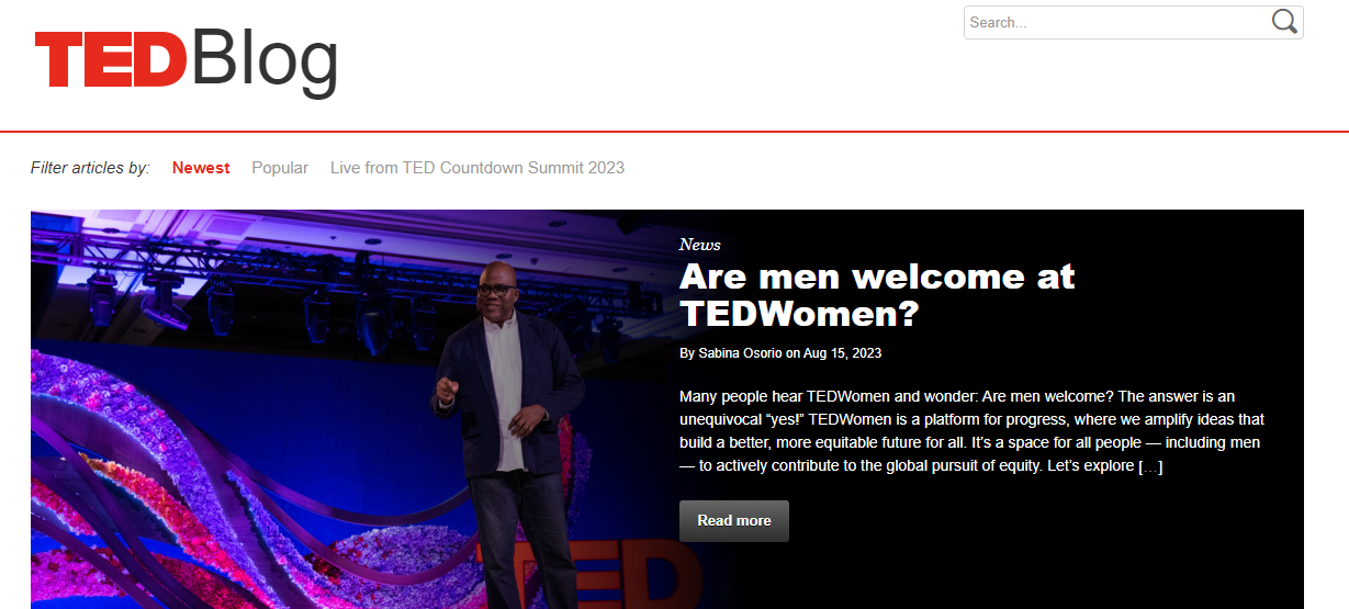
1. Ted Blogs
The following image of the TED blog page is a perfect example of a blog design for a news blog. The blog layout has a full-width header image highlighting the recent topic. The header also has a navigation bar, a log, and a search bar.
2. Copyblogger
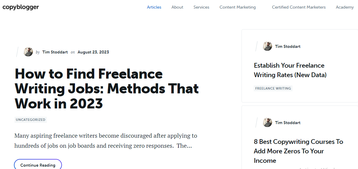
Look at this layout full of white space. The copy blogger blog pages it the best example showing you don’t always need to be creative. You can have a simple blog design like this one. A logo, a navigation bar, the article heading, and a snippet of the popular articles.
3. Amazon
Amazon is a very popular e-commerce platform. the best example for an e-commerce blog design. The blog follows the theme of the logo colors of Amazon that is blue and yellow.
The layout has different categories and a menu in the navigation bar a call to action button and a search icon. It has very smartly used the white space making the blog look more pleasant to the eyes.

4. Jack’s food blog
This example is for a food blog design. The blog has a half-width header covering the header with a beautiful image. The blogger has smartly used the image to highlight the heading of the article.

Furthermore, the blog has beautifully described the recipes and added images of them. This attracts the readers and fascinates them to continue exploring the blog.

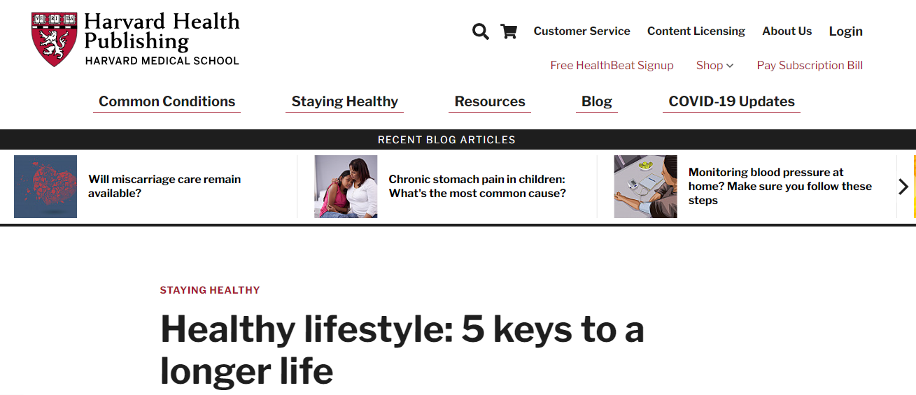
5. Harvard Health Publishing
This blog from the health industry has everything with a customized red and black theme matching the logo. A navigation bar, a category menu, the recent blog articles highlighting section a bold heading with a lot of white space is an ideal blog design for all types of blog articles. This blog design is fulfilling all the points of the best practices given above.
6. Fast2SMS
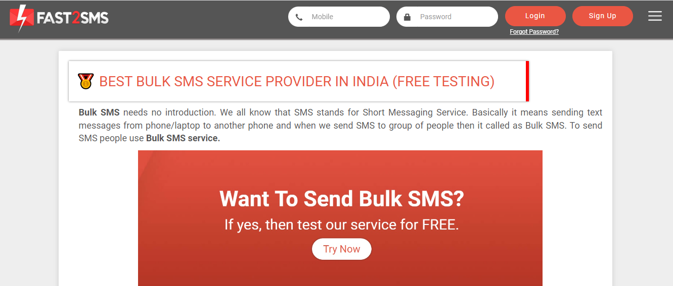
This blog article design example is from the telecom industry. Fast2SMS is a bulk SMS service provider. The following article shows a blog by fast2sms with a simple blog design. The theme is the same as the logo black and grey. The reason for choosing this as an example is the visual call-to-action added to the image.
7. Help Scout
Help Scout is an example of a modern blog design that uses simple hero images as thumbnails. The design has all the elements same as the standard blog design. The difference is in the way it presents the highlighted articles in the sidebar.
